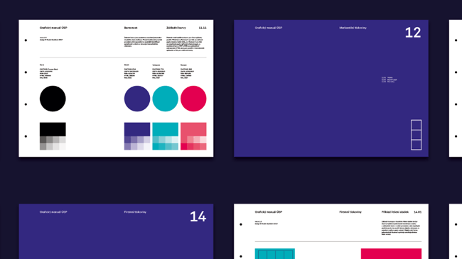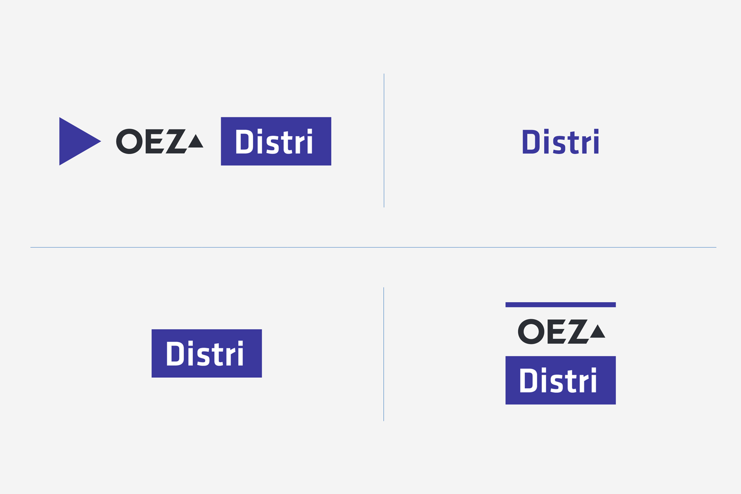
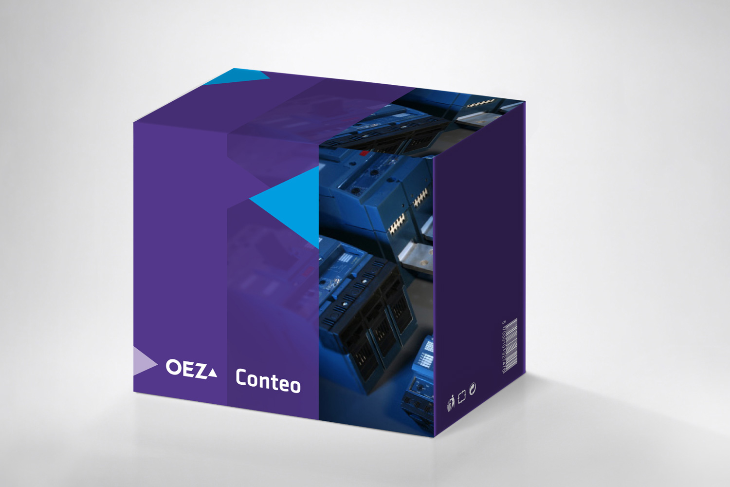

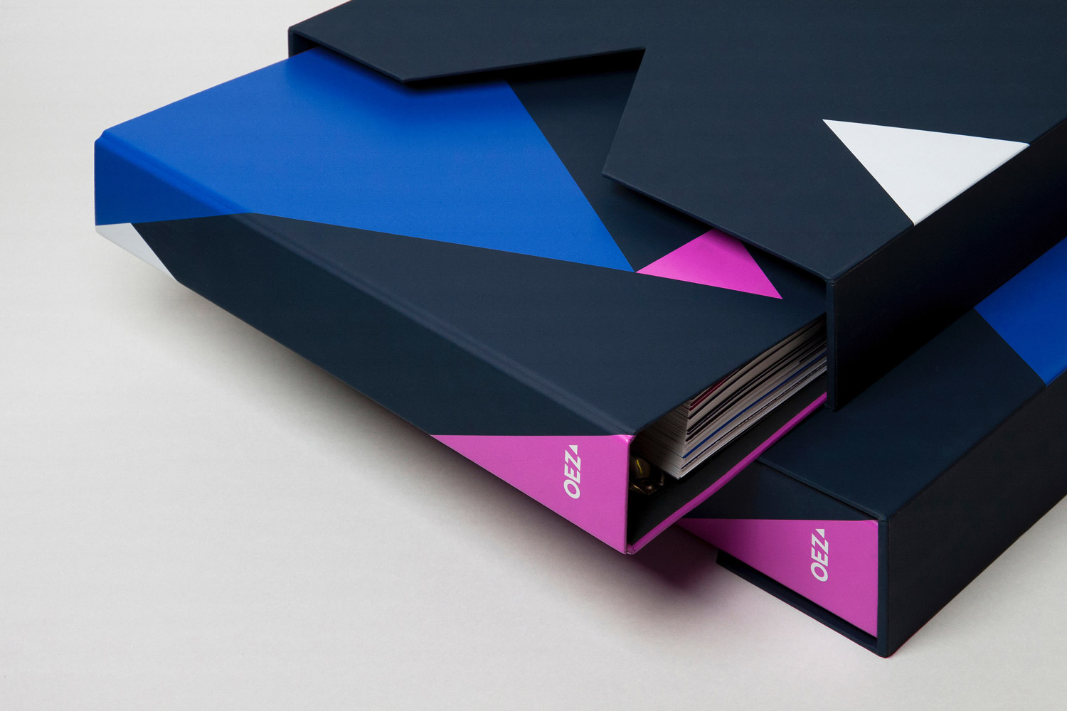
OEZ – visual style
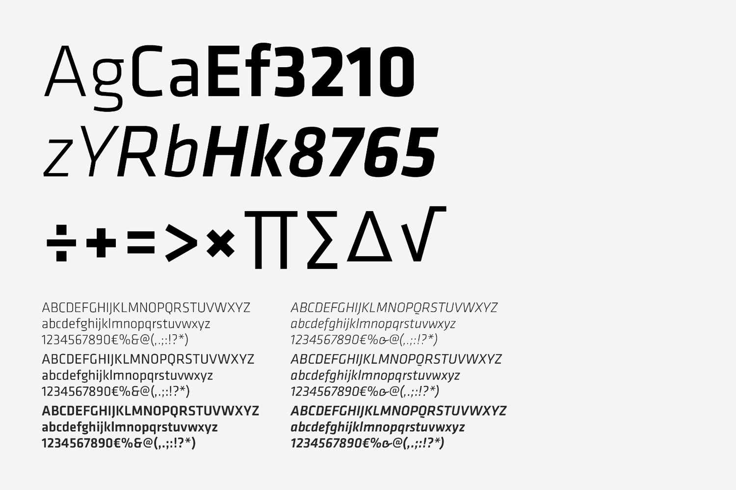
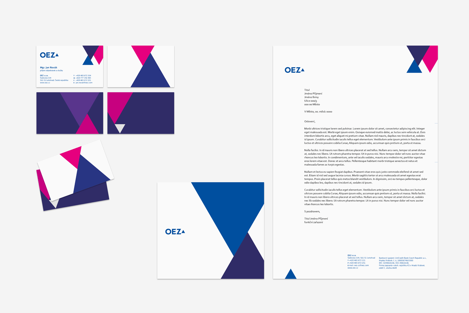
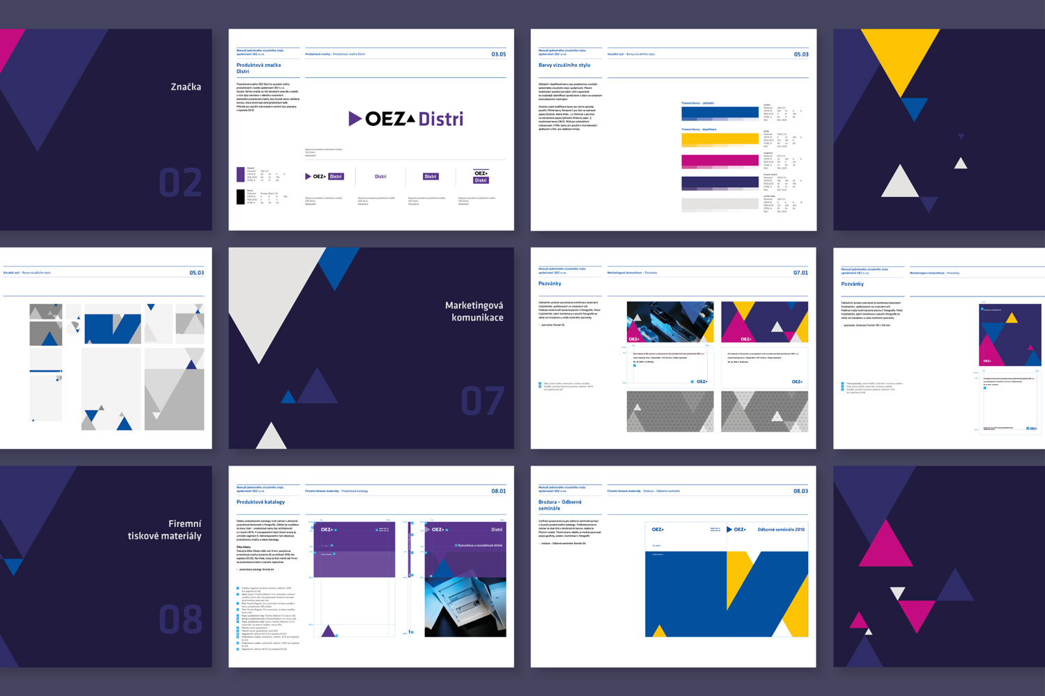
The OEZ company is one of the major producers of electrical wiring devices in Czechia. They have been on the market for a whopping 80 years. They are very intensely involved in the field of energy conservation and environmental protection. We won the tender for the logo’s redesign and streamlined the original typographic brand. The logo became the central feature for designing the modular network which supports the abstract-illustrative layer of the visual style, mutating the original basic shape into numerous simple compositions. The austere, technicist title typeface Klavika is balanced by the Serifa serif.
Year: 2010
Client: OEZ
Design: Michal Smejkal, Ondřej Lím
Font: Klavika, Serifa
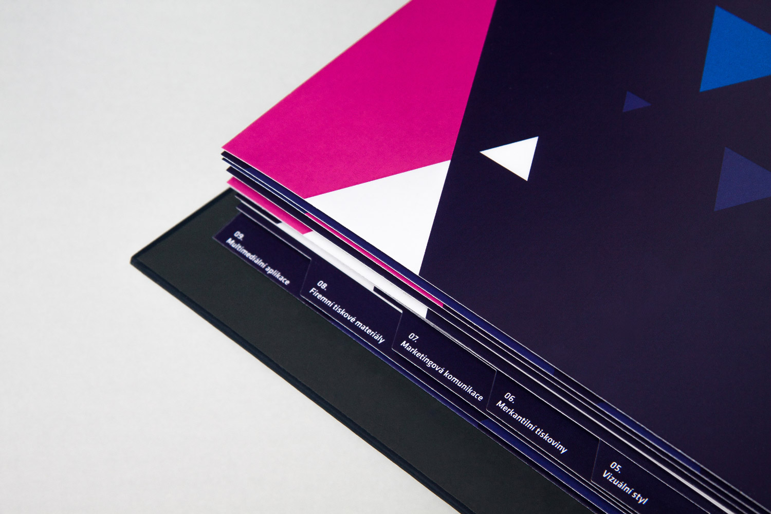
Cooperation: Studio Činčera (box for Brand manual)