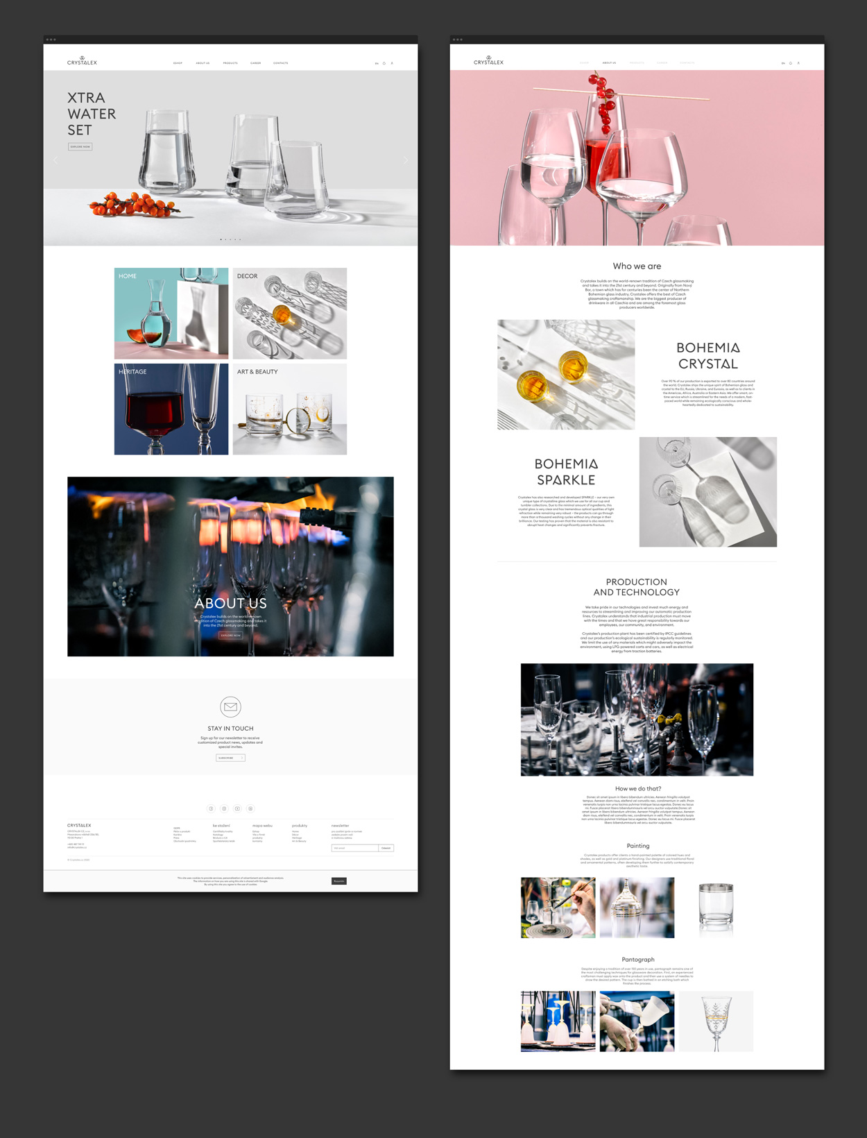
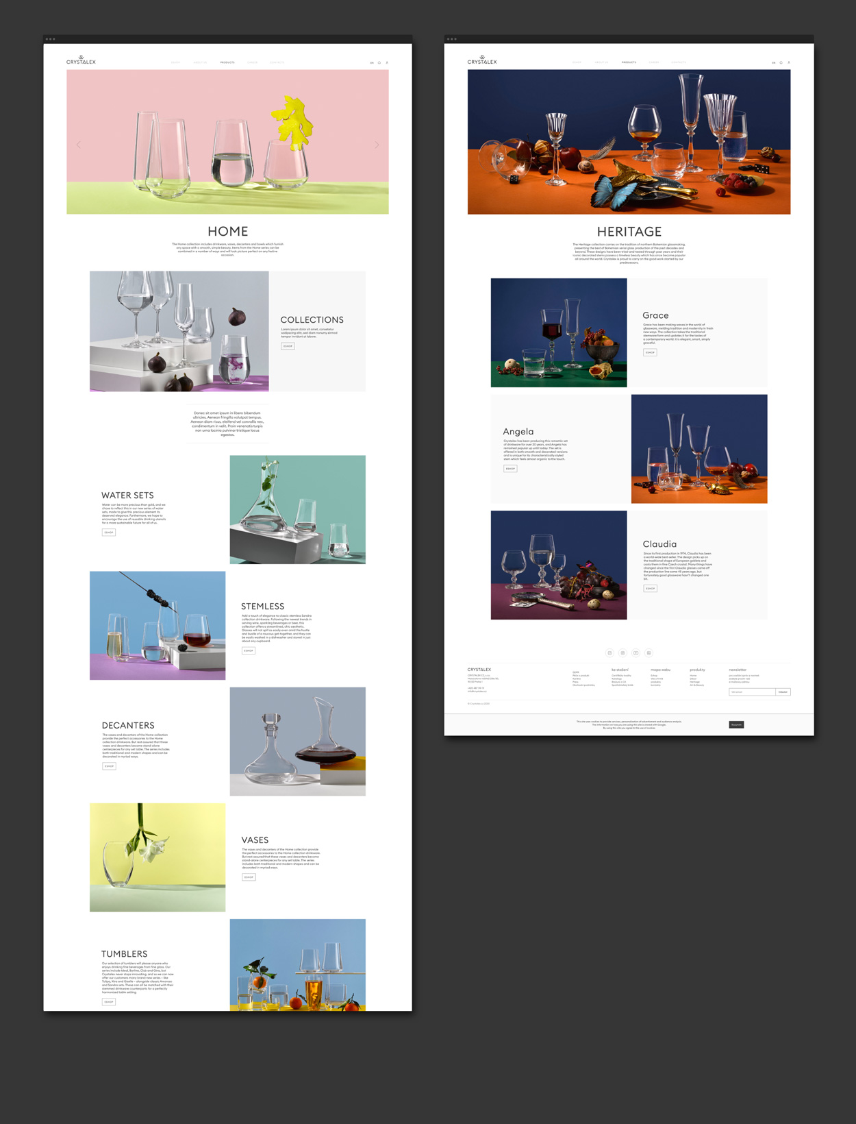
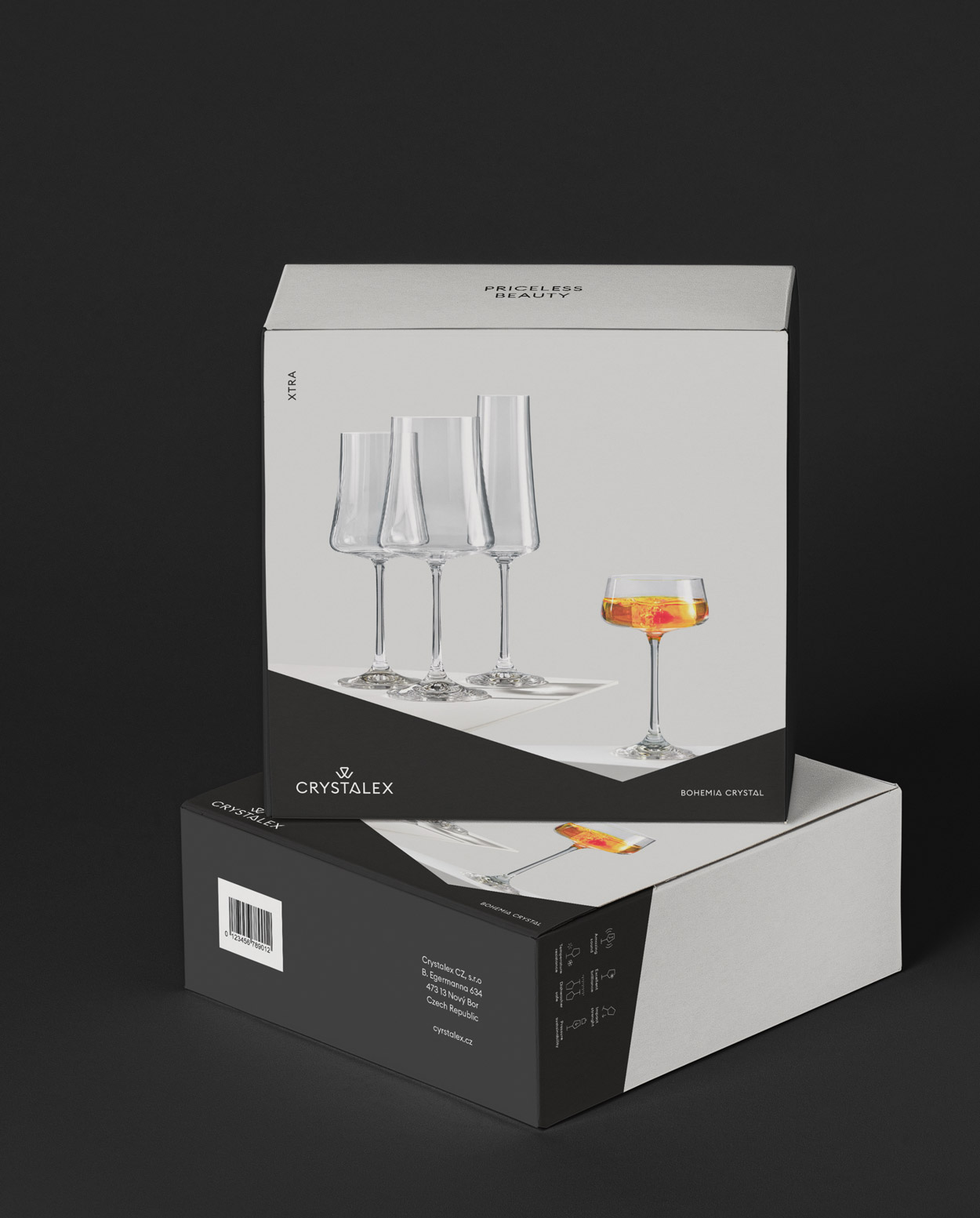
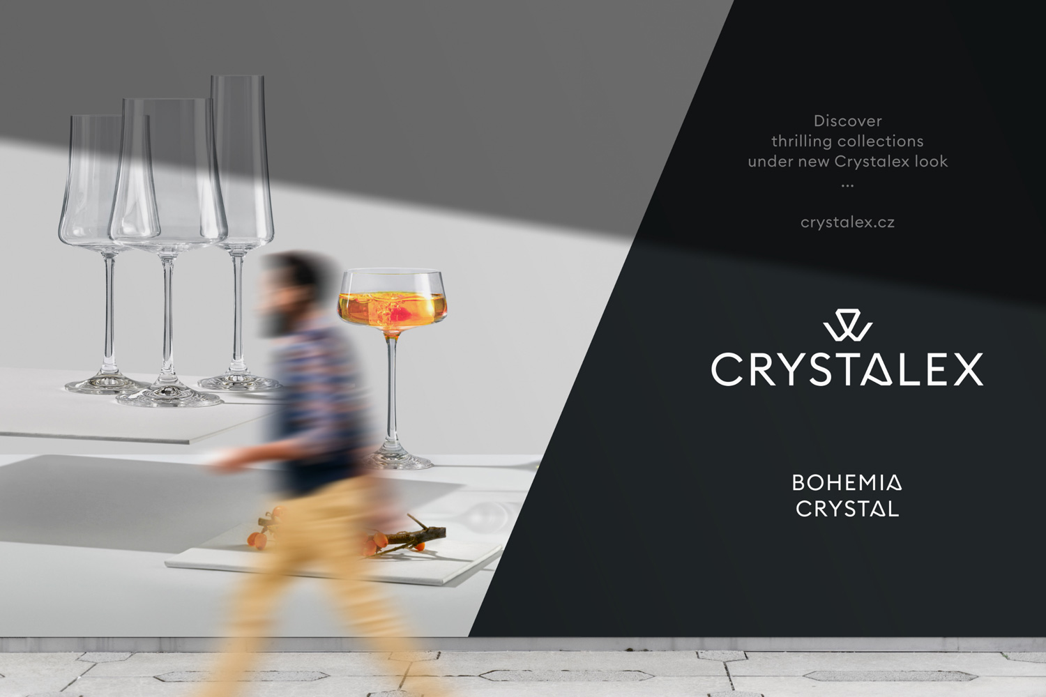
Crystalex – visual style
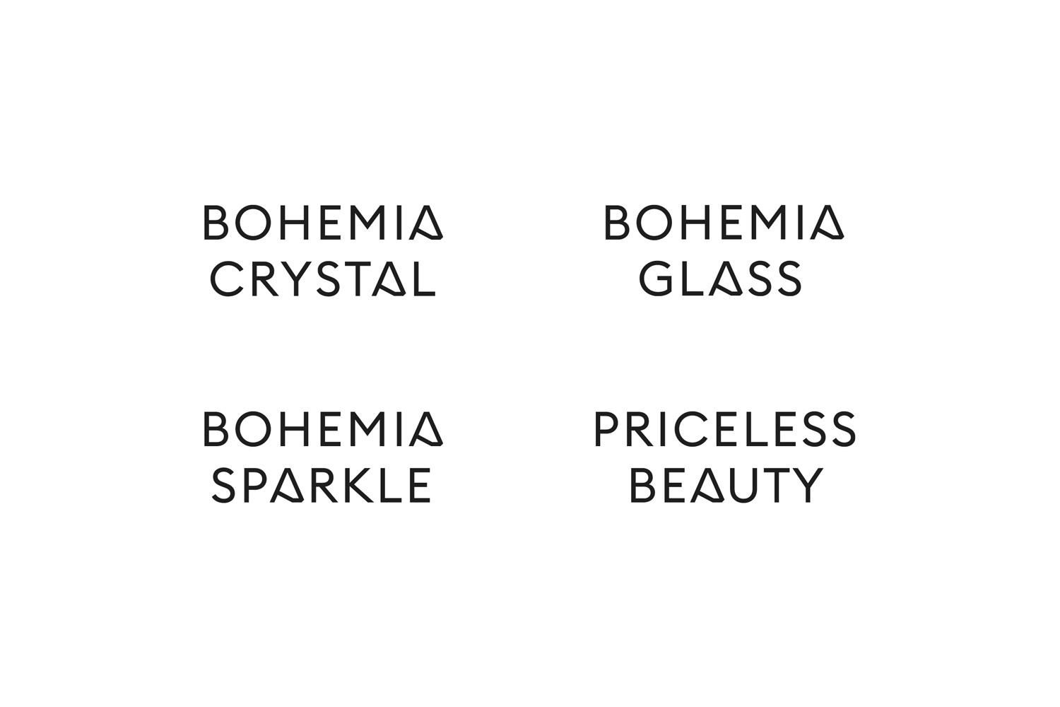
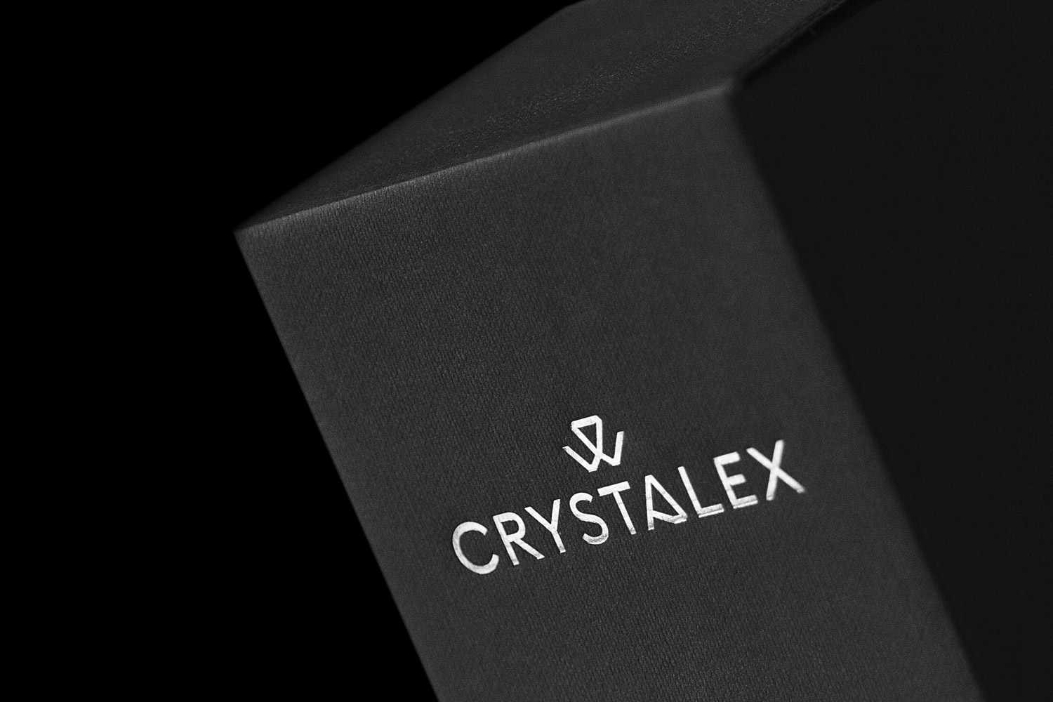
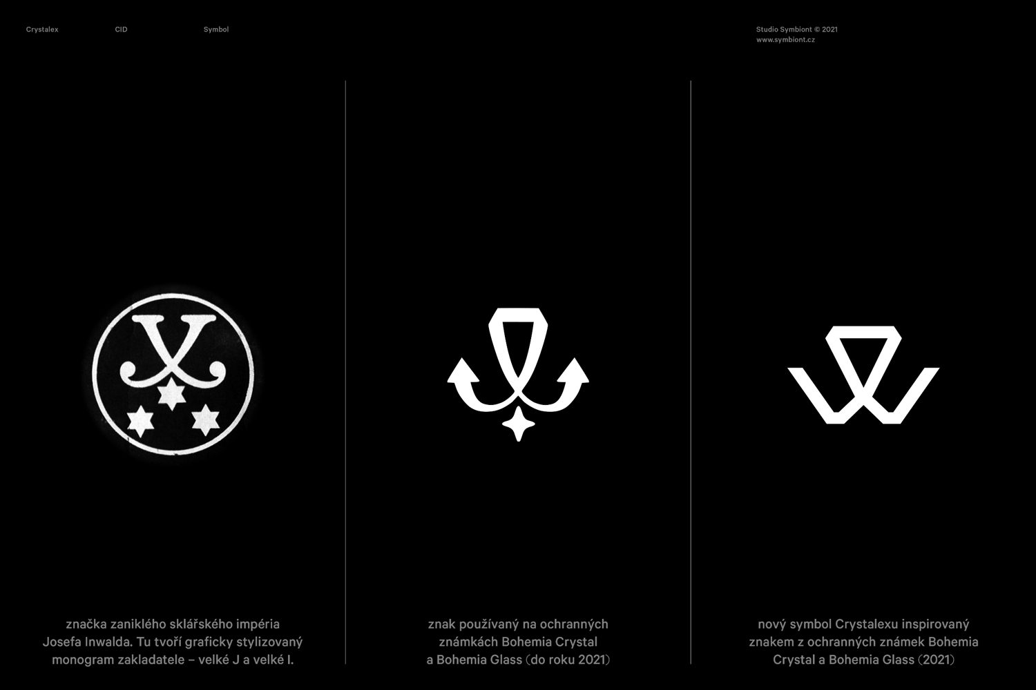
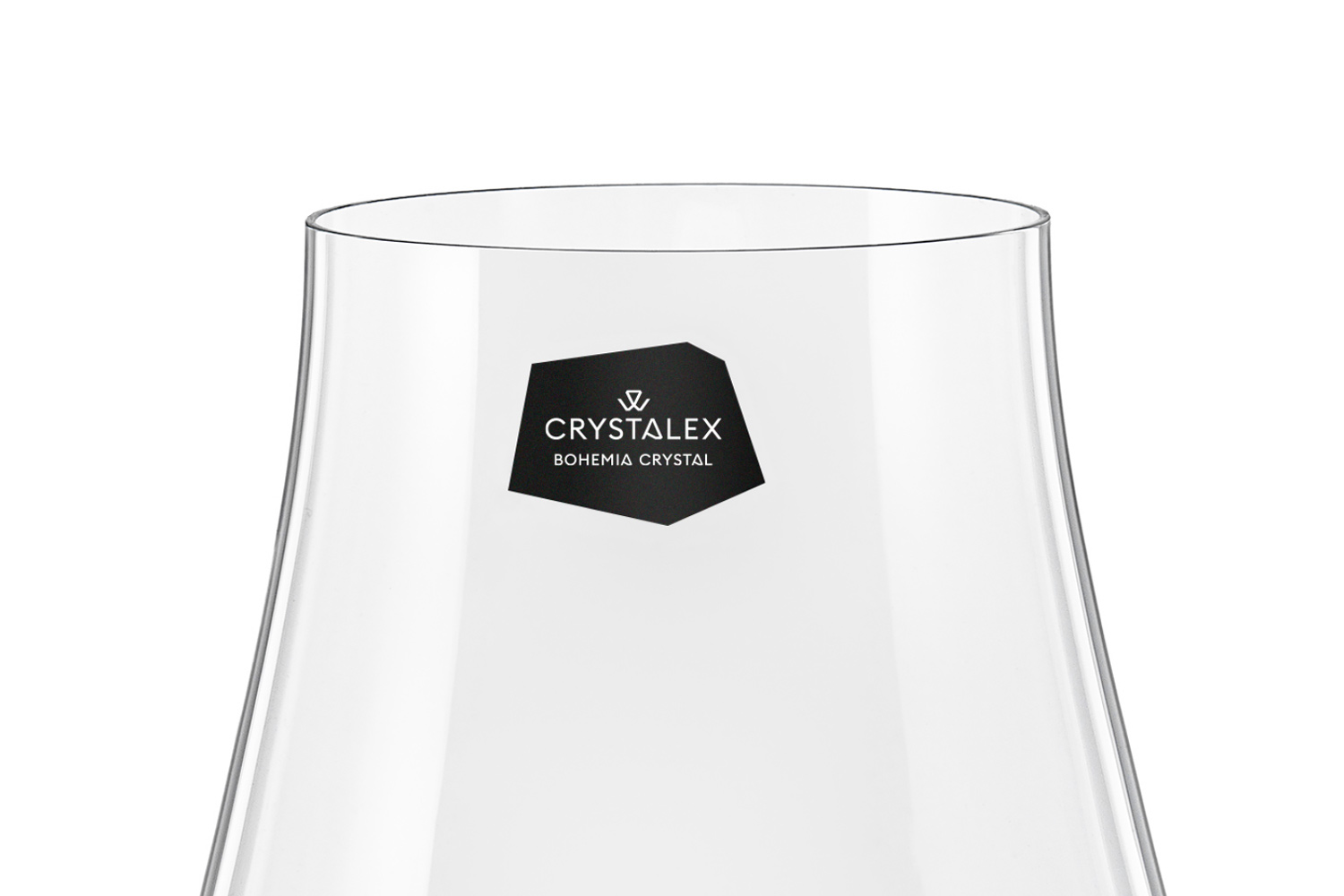
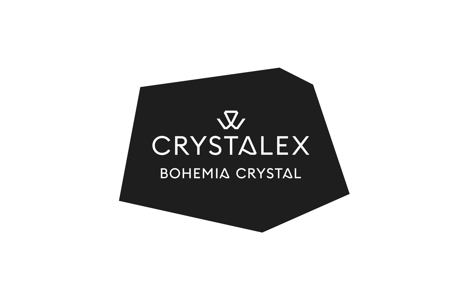
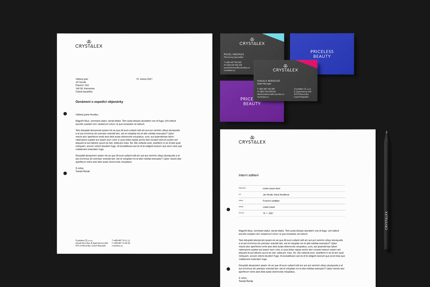
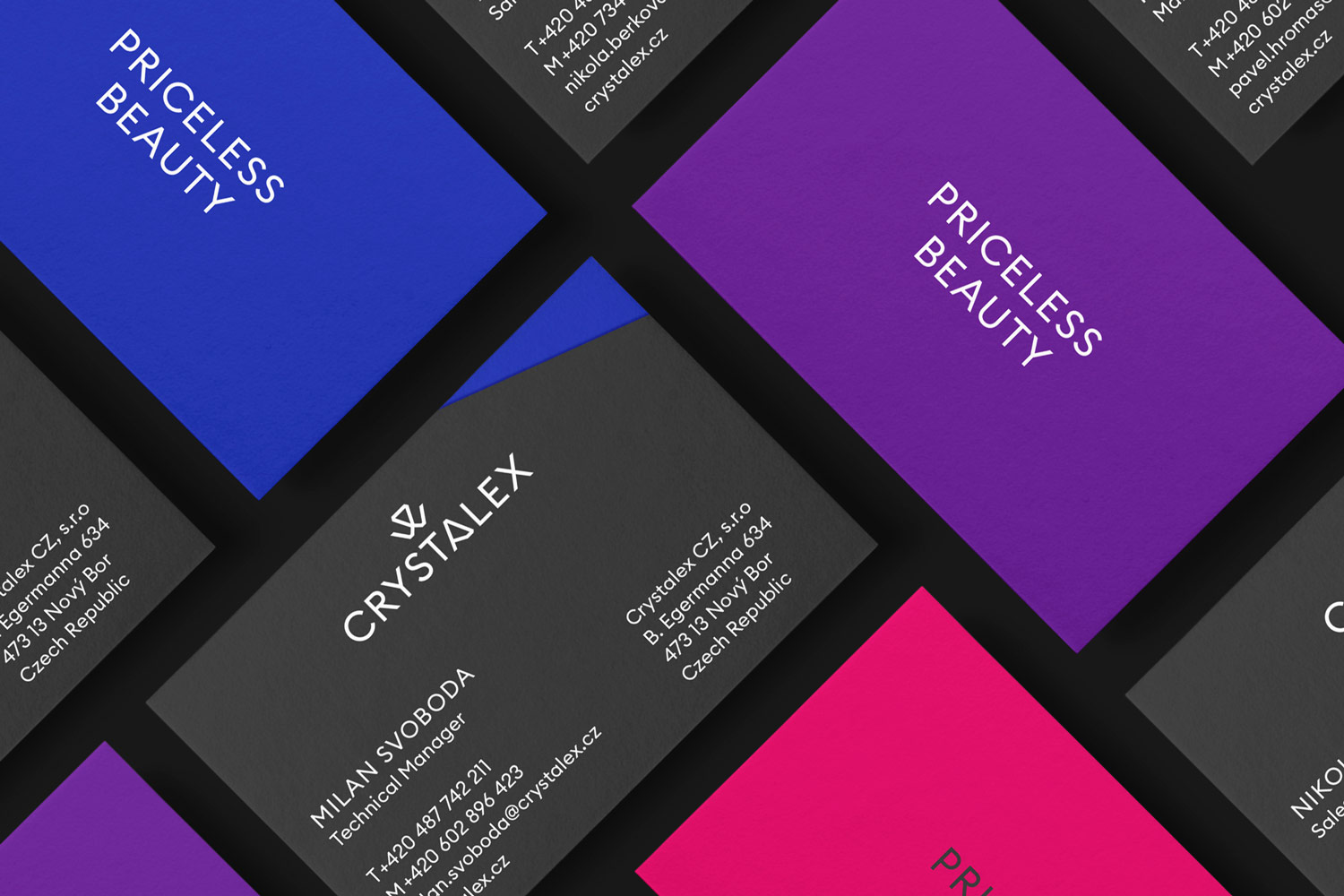
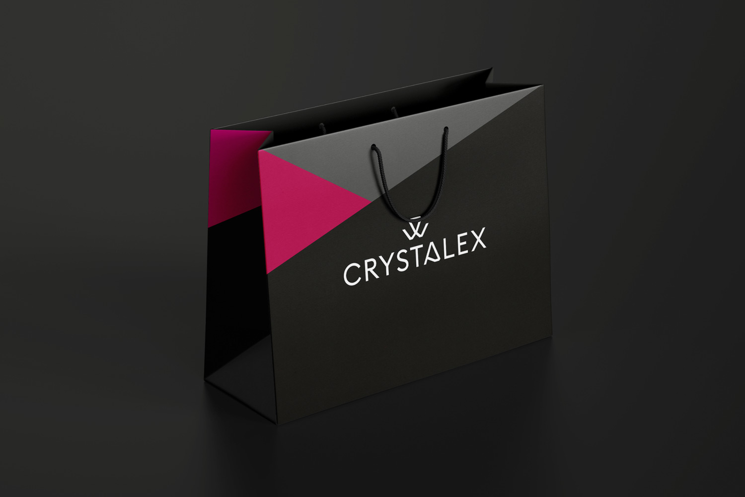
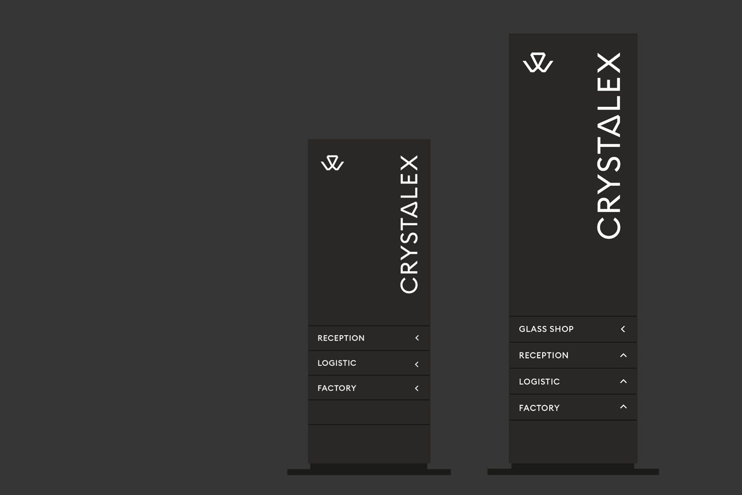
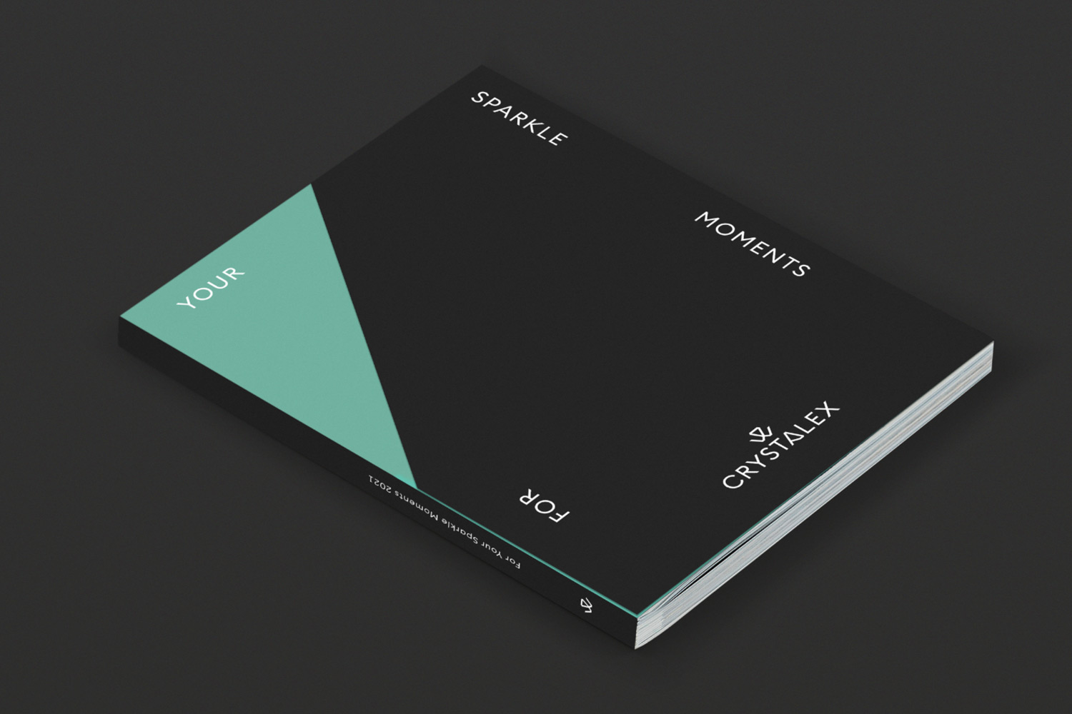
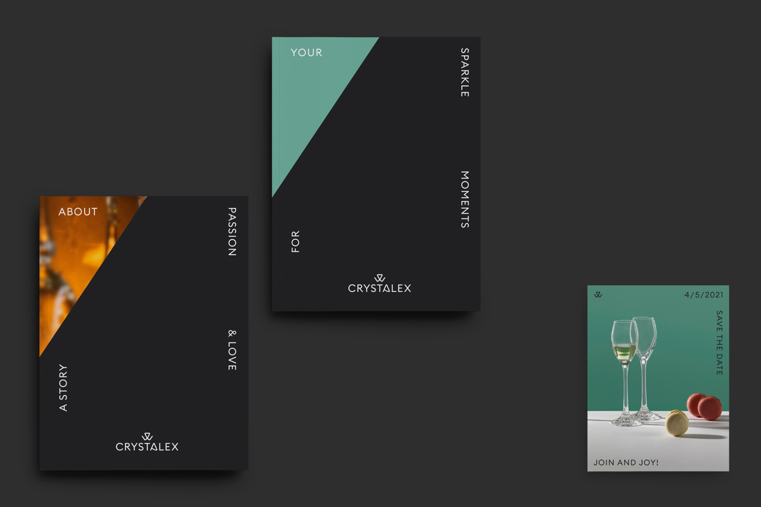
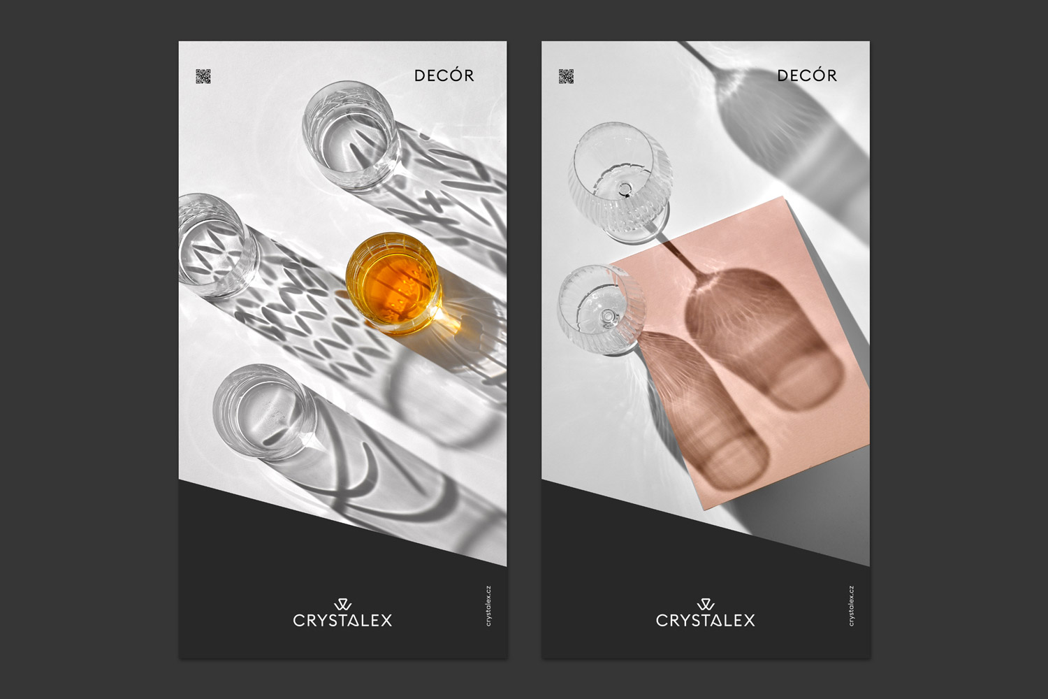
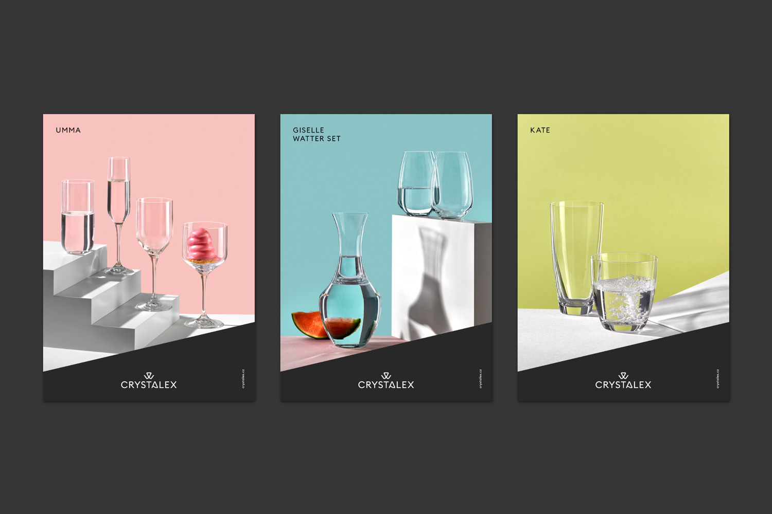
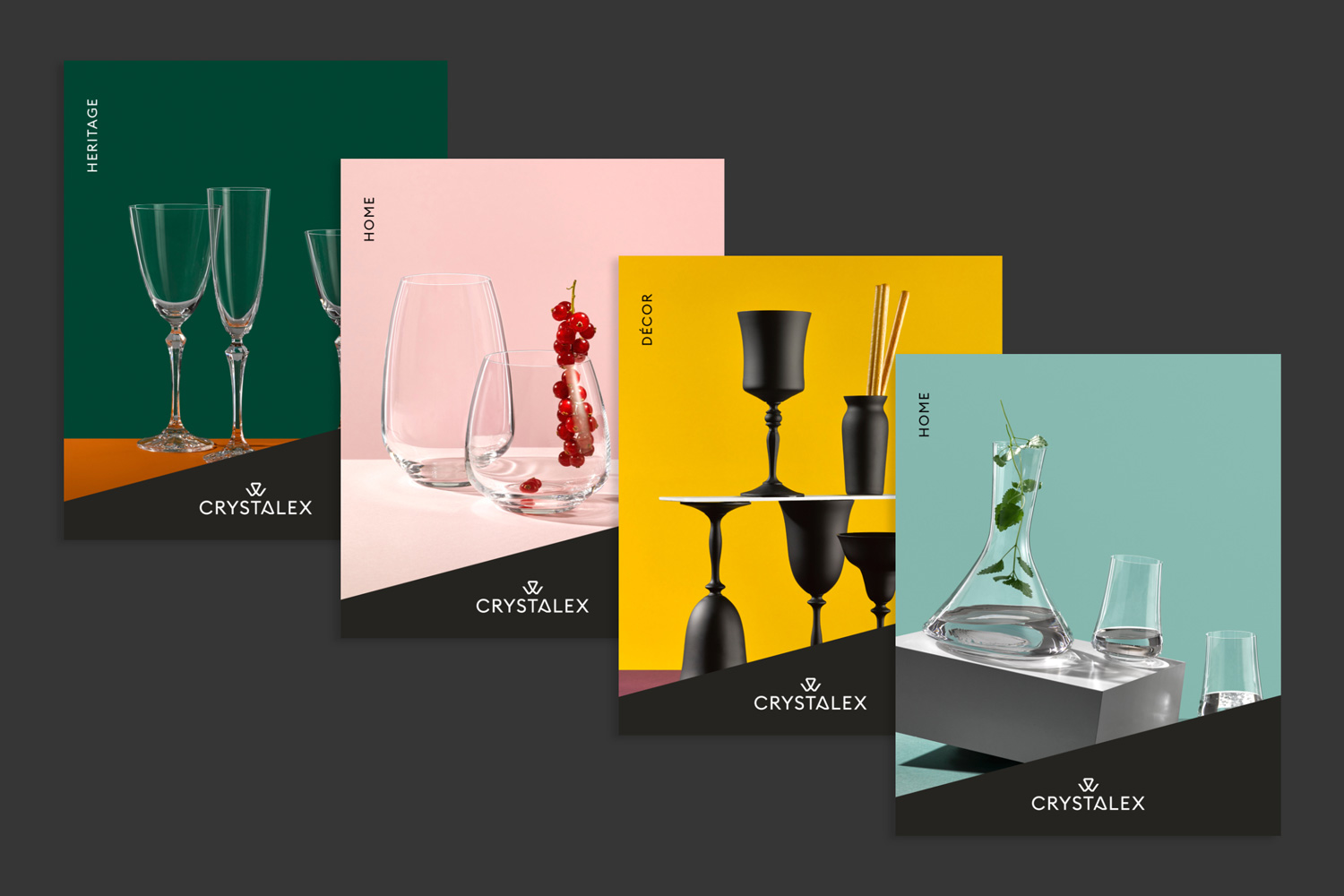
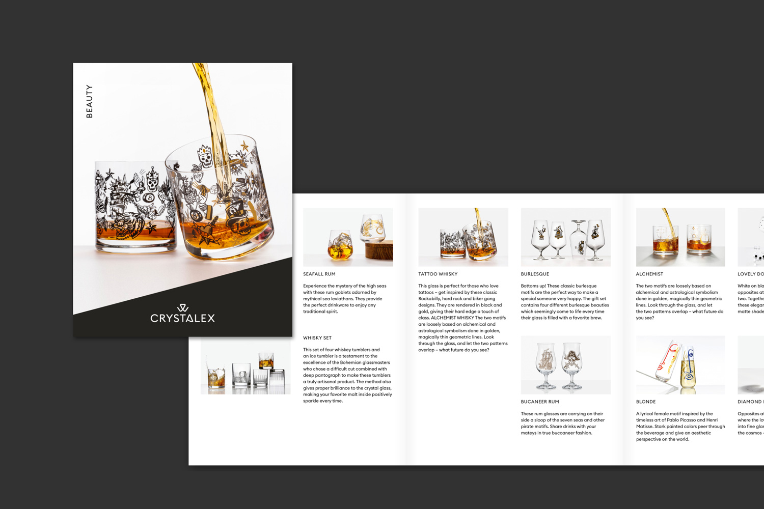
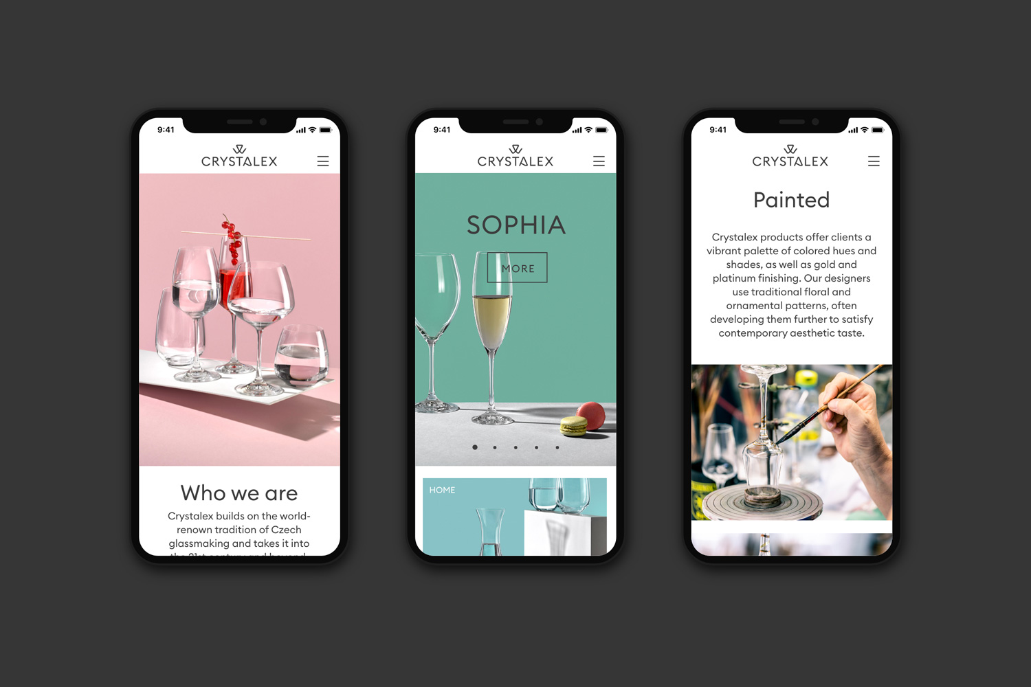
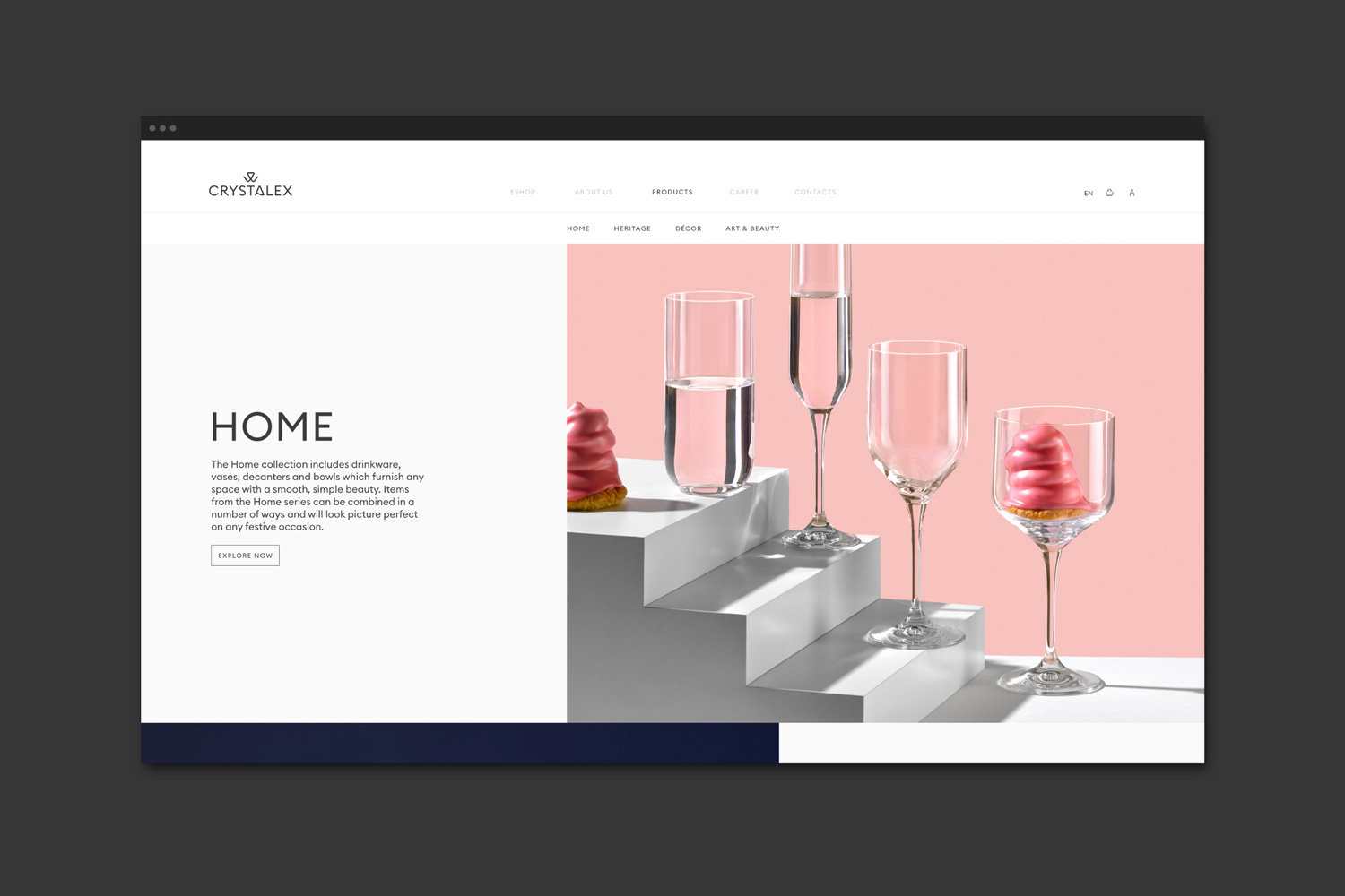
The company Crystalex approached us with a request: “We want to fell modern, not outdated!” They asked us to create a new logo and visual style for them which would befit their tradition, the craftsmanship and high quality of their products. We had no idea there would be such bold and positive feedback for our work, considering the major changes we had made. The name Crystalex has an almost magical effect, and needs no further explanation. The crystalline form of the ‘A’ and a revival of the pictogram from the brand’s original historical version stands at the basis of the brand’s redesign. And this novel morphology is used in all the company’s visual materials.
Year: 2021
Client: Crystalex
Design: Denisa Myšková, Michal Smejkal, Ondřej Lím
Font: Euclid Circular
Photo: Filip Šlapal, Andrea Thiel Lhotáková
Photo Postproduction: Jakub Přecechtěl